Bathroom of the Week
Who lives here: A single professional
Location: Chicago
Size: 65 square feet (6 square meters)
Design-build firm: Chi Renovation & Design
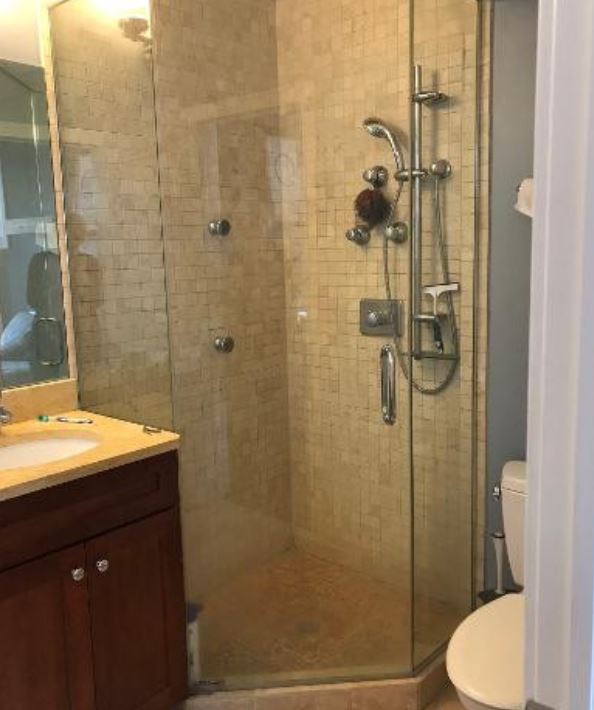
Before: In addition to the bulky jetted tub he never used, the condo owner disliked the dark atmosphere that the blue-gray walls, cherry vanity and beige tile created.
A corner shower stall (see “before” photo below) stood on the other side of the room, wedged between the vanity and toilet.
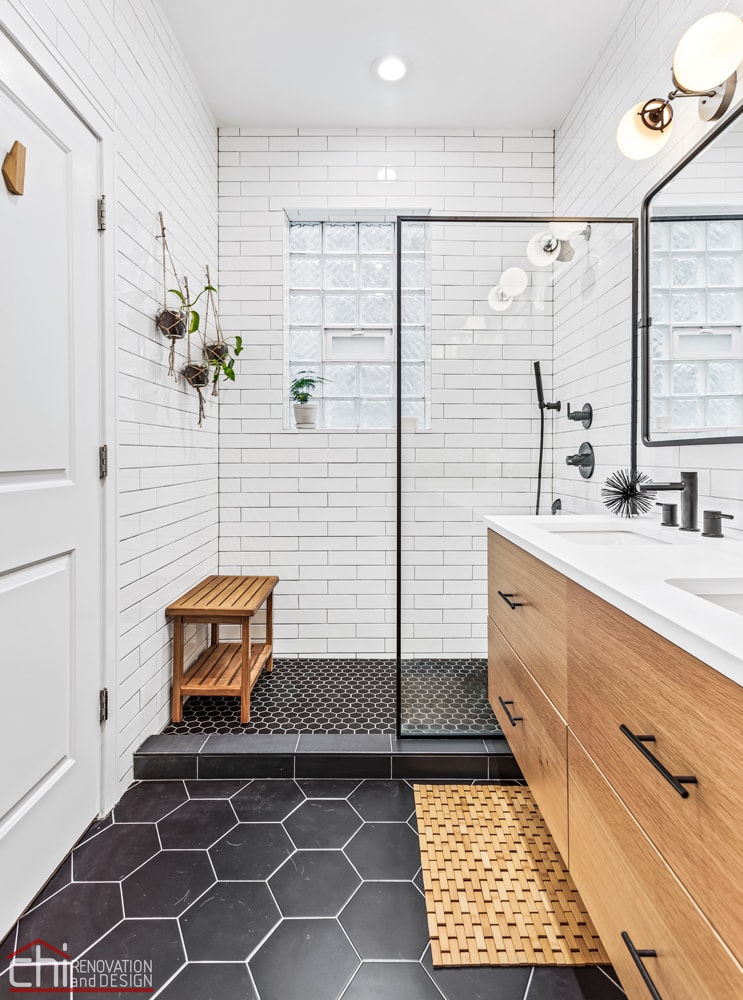
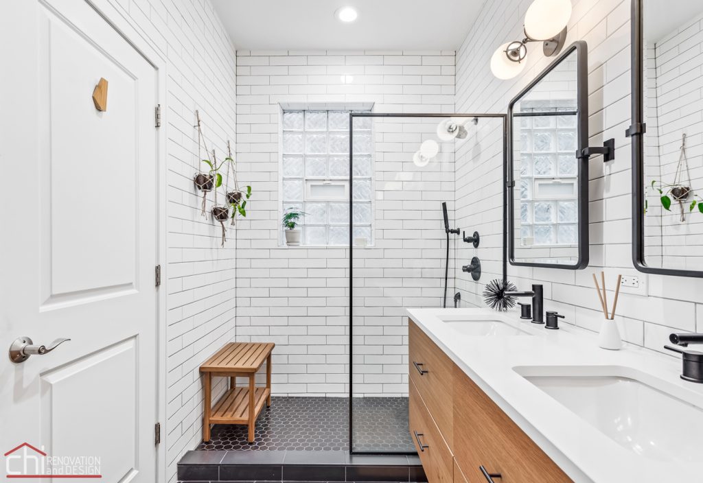
After: Ben Zur knocked the bathroom down to the studs and removed the jetted tub, old shower stall and vanity. He constructed a spacious new shower in place of the tub and installed a single fixed-glass shower panel. “The client knew he wanted a simple screen versus a traditional door,” Ben Zur says. “He was very particular about the aesthetic he had in mind.”
That aesthetic combines classic details with a contemporary twist. The white ceramic wall tiles with gray grout recall traditional subway tile, but their elongated 3-by-12-inch shape gives them a more contemporary look. “We initially discussed only doing tile up a standard wainscot height, but he wanted to take it to the ceiling,” Ben Zur says.
Shower screen: Meridian in matte black, 34 by 74 inches, Vigo; ceiling paint: Ceiling Bright White, Sherwin-Williams
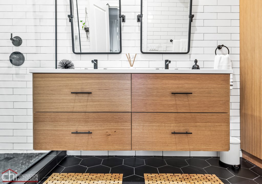
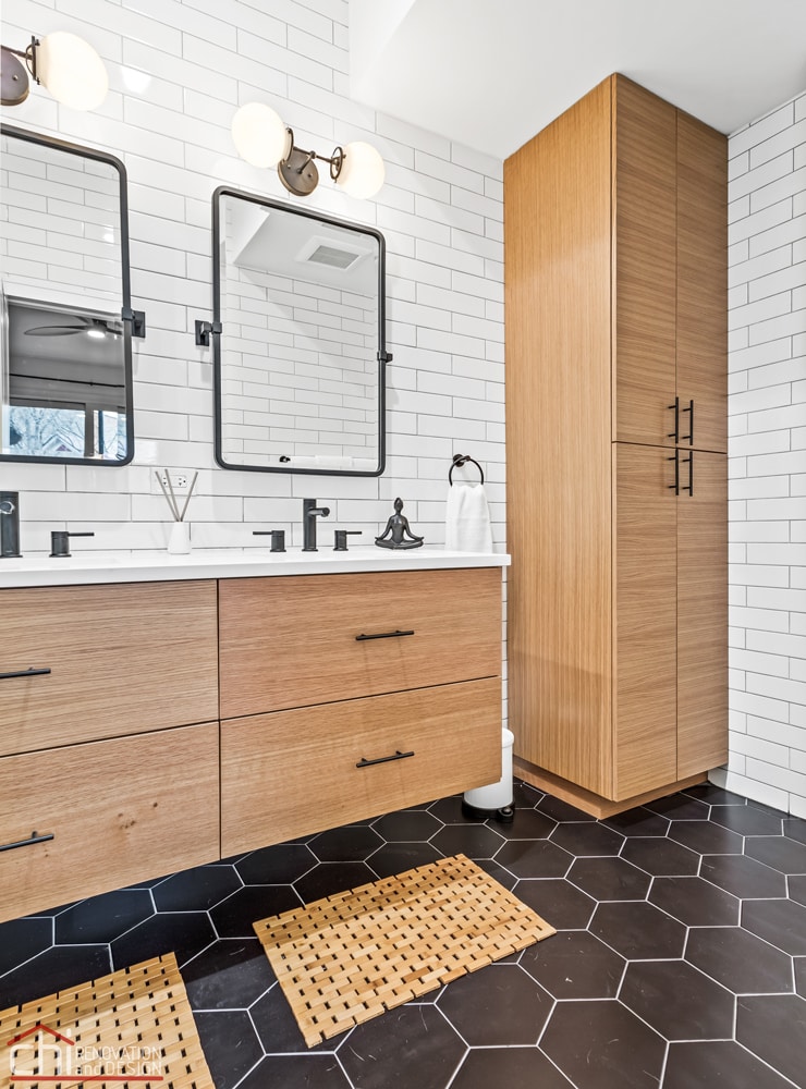
A new floating double vanity with matte black hardware features wide contemporary flat-panel drawers in rift-sawn white oak veneer in a natural finish and horizontal grain pattern. “We looked over a lot of wood samples to select the perfect tone,” Ben Zur says. “The client was adamant about having a floating vanity, and was accepting of the additional costs involved.”
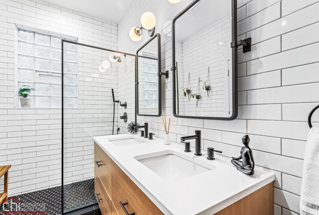
A pair of custom handmade glass-and-black-metal globe lights are mounted over two rounded rectangular brass-framed pivot mirrors. Ben Zur replaced can lights in the ceiling with LED recessed cans.
Double vanity: Madrid in natural finish, Bellmont Cabinet Co.
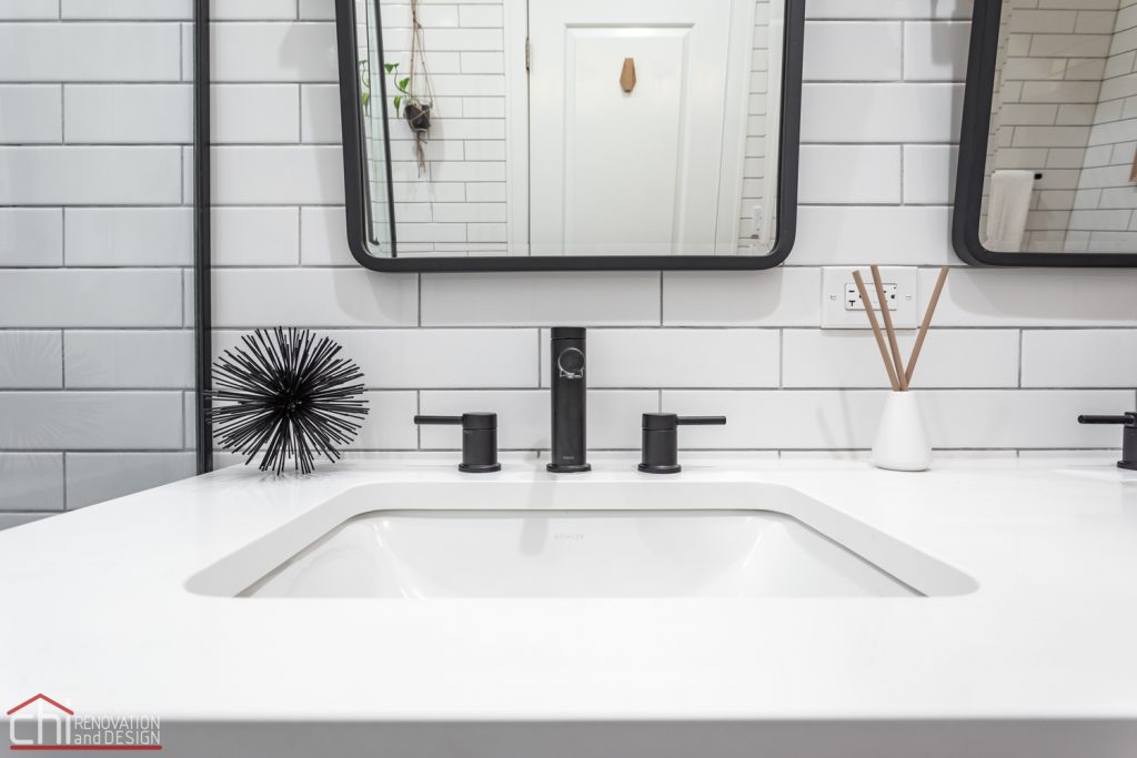
Undermount white sinks pair with minimalist matte black widespread faucets with double handles. “Undermount sinks allow for more space on the vanity overall and are easier to keep clean,” Ben Zur says. “Widespread faucets dress up the vanity a bit more.”
The Arctic White quartz top offers a durable surface that coordinates with the room’s color scheme. “We didn’t want any veining in the countertop to detract from the overall clean aesthetic,” Ben Zur says.
Sinks: Caxton rectangle undermount in white, Kohler; sink faucets: Align in matte black, Moen
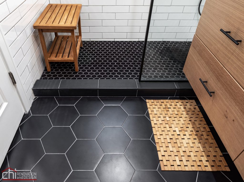
This photo highlights the black porcelain hexagonal tiles used for the bathroom floor and the smaller mosaic matte black hexagonal tiles used for the shower floor. “When you have a fairly simple color palette, mixing up the size of tile can create a bigger visual impact,” Ben Zur says.
Floor tile: Textilis hex in black (main floor) and Metro mosaic in black (shower floor), SomerTile
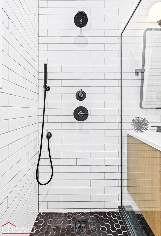
The open shower includes a single-function pressure-balanced shower system with shower head and hand shower and a square tile-in shower drain. “Although matte black fixtures have been in style for years now, finding chic, affordable options is still a bit difficult,” Ben Zur says. “These fit the bill.”
Shower drain: ClearFlo in matte black, Kohler
After: By eliminating the jetted tub and moving the shower across the room, Ben Zur was able to remove the shower stall and use the corner to create a custom linen closet that coordinates with the vanity.
Custom linen cabinet: Bellmont Cabinet Co.
This view shows how the improved layout provides more space around the new white one-piece comfort-height elongated toilet. An Energy Star-rated ceiling-mount exhaust fan above the toilet has a heavy-gauge galvanized steel and zinc housing that’s insulated to prevent condensation and promote durability.
Ben Zur says this project offers a good lesson for others considering a bathroom renovation. “Don’t be afraid to trust your gut,” he says. “The client knew he wanted to take the tile to the ceiling even when the design team was initially unsure. That being said, hiring a designer does help to pull all of the rest of your ideas together.”


